Stop Chasing Trends: 10 Web Design Shifts That Actually Matter
Web design trends move fast.
Too fast.
One year it’s muted minimalism and ultra-short sections. The next it’s AI-generated visuals, animated everything, and hyper-interactive scroll experiences.
Trends aren’t inherently bad.
But when they override clarity, usability, and strategy, they date quickly - and often cost you conversions.
If your website is starting to feel outdated, here are the (IMO) outdated web design trends I’d think twice about - and what to focus on instead.

1. Overusing AI design elements
The trend: AI-generated imagery. AI-generated icons. AI-generated animations. AI-generated everything.
The issue: AI tools are powerful (and I use them a lot in my own business) - but when everyone uses the same generators, websites start to look eerily similar. Polished. But generic.
And generic doesn’t build authority.
Overuse of AI imagery can dilute brand personality.
Overuse of AI animation can feel gimmicky.
Overuse of AI interactions can overwhelm users.
What to do instead:
Use AI strategically, not excessively.
Blend custom visuals, real photography, and brand-led design with subtle AI enhancements where they add value - not just novelty.
Your website should feel human. Not auto-generated.
An AI-generated photo of me. Spoiler alert…. It’s me. But it’s also not me. And it’s weird and inauthentic.
2. Auto-playing videos
The trend: Landing on a website and being greeted by a full-screen video that starts playing immediately.
The issue: Auto-play might feel cinematic. But it often slows load speed, disrupts accessibility, and annoys users - especially on mobile.
I for one, hate them.
As a mum who is often scrolling while my kids fall asleep… an auto-play video (when I forgot to mute my phone) = bed-time doom!
But back to your website…
Visitors want control. Not surprise audio or unexpected motion.
It also dates quickly. What feels premium today can feel intrusive tomorrow.
What to do instead:
If you use video, make it intentional.
Let users choose to press play. Use it to support storytelling - not replace clear messaging. And always prioritise load speed and performance over spectacle.
3. Excessive pop-ups
The trend: Multiple pop-ups layered over each other - exit intent, discount offers, newsletter prompts, chat bubbles - sometimes within seconds of landing on a page.
The issue: More interruptions don’t equal more conversions.
They increase friction.
When every action triggers a pop-up, the experience feels desperate rather than strategic.
What to do instead:
Simplify your conversion points.
One clear lead magnet. One intentional timing trigger. One primary call to action.
Conversion optimisation isn’t about shouting louder. It’s about reducing friction.
4. Ultra-short website sections
The trend: Tiny sections designed to fit in the space of your screen. Bite-sized fragments instead of endless scrolling.
The issue: While this trend makes sense on screen (to ensure you don’t have to scroll to get the full message), ultra-short sections often strip your content of flow and stop your brand story from shining through.
Complex services need space. Positioning needs clarity. Trust needs explanation.
But, when everything is condensed into short snippets, storytelling disappears.
What to do instead:
Embrace intentional depth.
Use taller sections when needed. Let copy breathe. Guide readers through a narrative flow - problem, insight, solution, next step.
Storytelling builds authority.
Fragmentation weakens it.
5. Flat, overly sterile design
The trend: Flat colour blocks. No texture. No layering. No dimension.
The issue: Flat design had its moment. But when overdone, it can feel lifeless and generic.
Modern brands need subtle depth - visual cues that create hierarchy and guide the eye.
What to do instead:
Introduce texture and layering thoughtfully.
Subtle gradients.
Soft shadows.
Overlay elements.
Visual rhythm.
Not clutter. Not chaos.
Just enough dimension to feel modern without sacrificing clarity.
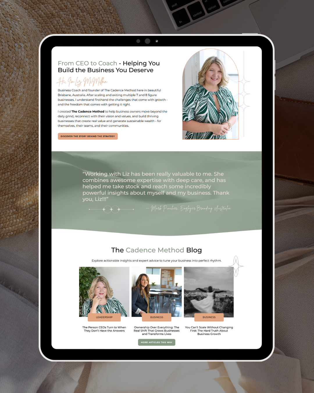
This client wanted to her website to feel like music, so we used images of sand dunes, overlayed with her brand colours, to create textured backgrounds that gave the feeling of flow and rhythm.
6. Tight, cramped layouts
The trend: Fitting as much as possible above the fold. Compact spacing. Minimal padding.
The issue: When everything is squeezed together, nothing feels premium.
Whitespace isn’t empty space.
It’s visual confidence.
Tight layouts create cognitive overload. Breathing room creates authority.
What to do instead:
Design with space.
Allow margins. Increase line height. Use padding intentionally.
Space improves readability, hierarchy, and perceived value.
7. Overly soft, muted design palettes
The trend: Ultra-neutral beige everything. Soft-on-soft colour combinations. Minimal contrast.
The issue: If your branding uses soft, muted colours, there is nothing wrong with that. But excessive neutrality often blends into sameness - so don’t be afraid to embrace colour to stand out.
What to do instead:
Use colour with intention.
Strategic contrast. Clear call-to-action highlights. Confident accent tones.
Colour isn’t noise when it’s aligned with positioning.
In many industries right now, the shift isn’t toward softer - it’s toward stronger.
8. Hidden navigation and “clever” layouts
The trend: Minimal menus. Hidden navigation. Abstract page structures that feel different for the sake of being different.
The issue: Your audience is not here to solve a puzzle.
They want familiarity. Predictability. Ease. When navigation is unclear, bounce rates rise - and conversions drop.
What to do instead:
Design for flow.
Keep your primary navigation simple. Use clear page labels. Follow intuitive structure.
A website shouldn’t require explaining. It should guide naturally.
Good UX isn’t flashy. It’s invisible.
9. Overuse of animations and movement
The trend: Scroll-triggered animations. Hover effects on everything. Sections sliding in from every direction.
The issue: Movement can enhance experience - but too much creates distraction, slows load times, and often hurts accessibility.
It also dates quickly.
What feels modern today can feel gimmicky in 18 months.
What to do instead:
Use movement sparingly and intentionally.
If animation supports clarity, keep it. If it’s there just to impress, remove it.
Subtle > dramatic.
Performance and accessibility always win.
10. Overcomplicating the homepage
The trend: Long, sprawling homepages with 15 sections, five different calls to action, and multiple offers competing for attention.
The issue: When everything is important, nothing is.
Overloaded pages dilute messaging and create friction.
What to do instead:
Simplify.
One primary goal. One clear pathway. Intentional supporting sections.
A homepage is not a scrapbook. It’s a strategic entry point.
The real shift: from trendy to strategic
Trends aren’t inherently bad.
But they should serve your goals - not replace them.
Before adopting any design trend, ask:
Does this improve clarity?
Does this support usability?
Does this align with my positioning?
Will this still feel relevant in two years?
If not, it’s probably decorative - not strategic.
Good design is invisible. It just works.
And when your website works, you don’t need to redesign it every time a trend becomes untrendy.
If your website feels outdated, it might not need a dramatic redesign.
It might need a strategic filter. Keeping what works. Removing what distracts. Refining what supports growth.
If you’re unsure where your design is helping - or hurting - your growth, book a free call with me today. We’ll review what’s dated, what’s distracting, and what will actually move your business forward.
No trend-chasing.
No unnecessary redesigns.
No pressure.
Just purposeful next steps.