What clients mean when they say "you made it make sense"
There's a phrase that keeps turning up in my client feedback. Different women, different industries, different projects. Same five words.
"You made it make sense."
Not "I love the design." Not "the colours are gorgeous." Those comments come too, and they're lovely. But the sentence people reach for when they're describing what changed is about sense, not style. After hearing it enough times, I stopped treating it as a compliment and started treating it as data. Because it tells you something important about what people are buying when they hire a website strategist. And it's not pixels.
The state before: everything's a guess
Here's what the "before" usually looks like.
She's built a real business. She knows her work inside out. But the website has become this low-grade, permanent source of noise. She's tweaked the copy. Moved sections around. Asked friends for opinions. Read blog posts about hero sections and CTAs. Every change feels plausible, and none of them fix it.
The problem isn't a lack of effort. It's that she's pulling levers without knowing which one is connected to anything.
One of my clients, Trenna, described that stage as feeling completely overwhelmed. That's the honest word for it. Not confused about websites in general, but overwhelmed by the sheer number of things that could be the problem. Is it the copy? The layout? The offer? The photos? When everything might be the issue, everything becomes your responsibility. That's exhausting.
So "you made it make sense" isn't really about the website. It's about the end of the guessing.
What "making sense" is made of
When I unpack what happened in those projects, the moment things clicked was almost never a design moment. It was one of these:
Every element exists for a reason. The homepage headline says this because your best clients arrive with that question. The services page sits in this order because that's the order people decide in. When each piece has a job, the whole site stops being a collection of opinions and becomes a system. You can defend it. More importantly, you can stop second-guessing it.
The site started matching how the business runs. Most struggling websites describe a business that existed three years ago. Old offers, old positioning, old priorities. Part of making it make sense is straightening the story out, so what someone reads online matches what they'd hear on a call with you.
Things got removed. This is the one that surprises people. Clarity rarely comes from adding more. It comes from taking away the pages, paragraphs and buttons that were only there because someone once said they should be. A website with less on it, where everything that remains has a purpose, reads as more confident. Because it is.
None of that is decoration. It's decision-making. The design is where those decisions become visible.
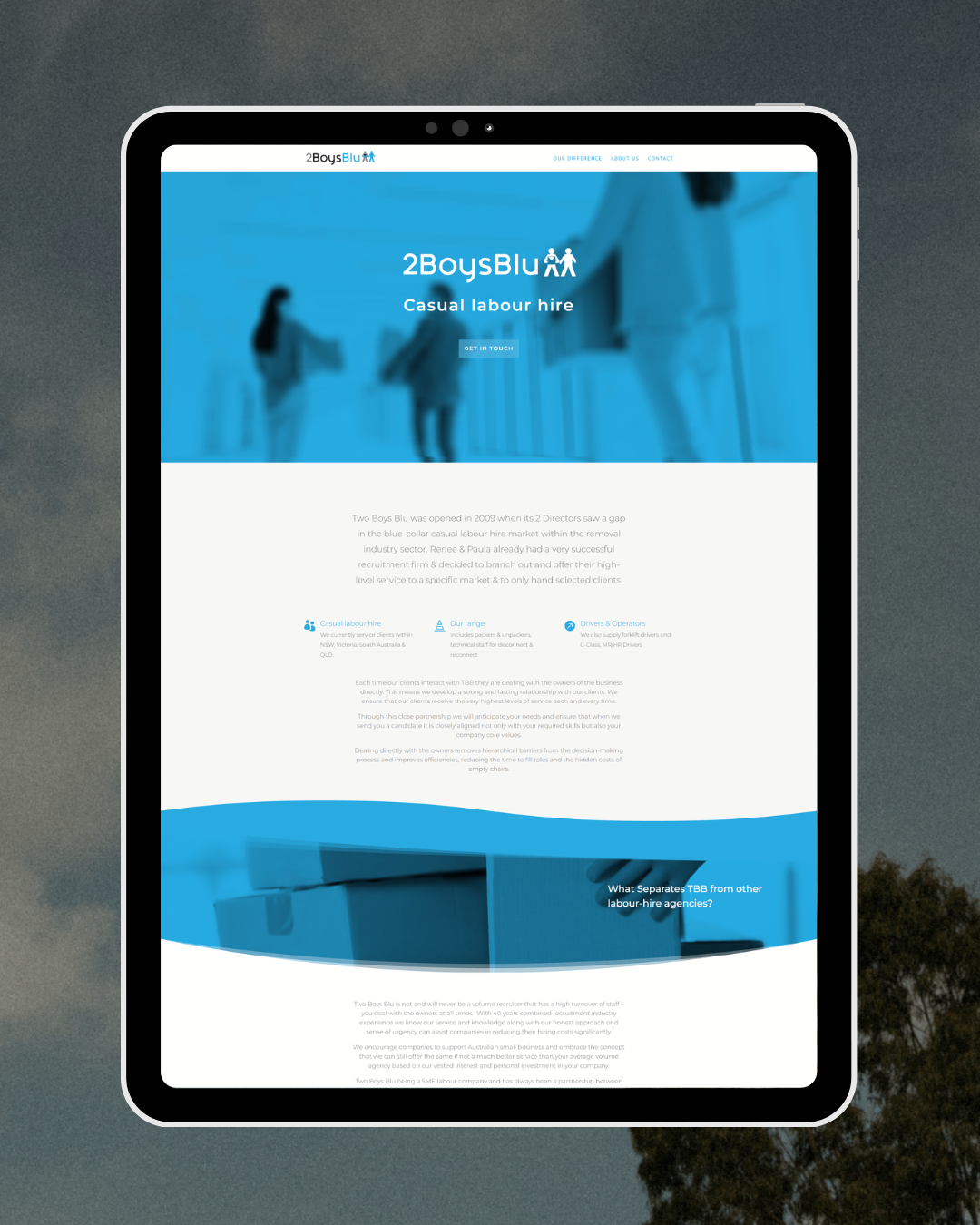
Two Boys Blu - Before a Website Sprint
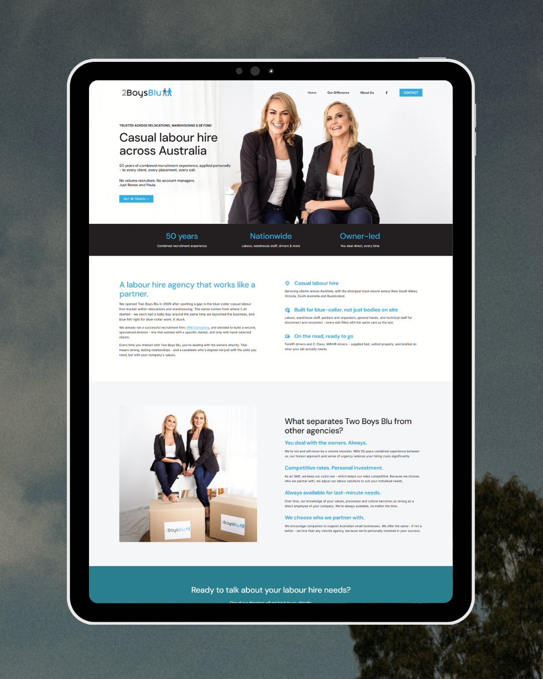
Two Boys Blu - After a Website Sprint
Why this matters if your website "feels off"
If you're in the before state right now, the useful takeaway is this: the feeling of "something's off but I don't know what" is not a design problem. It's a clarity problem wearing a design costume.
Which means another round of tweaking probably won't fix it. Not because you're doing the tweaks wrong, but because tweaking is an execution activity, and what's missing is upstream of execution. You can't polish your way to a website that makes sense. You have to decide your way there first. What is this site for, who is it for, what should each page do, and what happens next at every step.
That's why my whole process runs on one rule: strategy before pixels. It's not a tagline for the sake of one. It's the difference between a website you keep apologising for and one you'd send to anyone without a second thought.
Clarity is the product
Here's where I've landed after years of hearing that phrase.
Clarity is the product. The website is just where it shows up.
When a client says I made it make sense, she's not describing pages. She's describing the moment the mental load lifted. The moment she stopped carrying "I need to fix my website" around in the back of her head. The moment she could understand why each element on her website existed - and how they help her.
Another client, Kelly, put it this way: "I walked away with clarity, confidence, and a site I actually understand." Notice the order. Clarity first. The site comes last, almost as a byproduct.
That reframe changes how you think about your own website too. If yours isn't working, the question isn't "what should it look like?" The question is "what needs to make sense first?"
Sit with that one for a while. It usually points somewhere more useful than the font menu.