What actually changed when Two Boys Blu's website caught up with their business
Two Boys Blu came to me this year with a straightforward brief: redesign the website. A new look, a bit more energy, something that finally felt like the business they'd grown into.
We did redesign it. But the part of the brief that mattered most had nothing to do with design, and by the time we got there, it was the easiest part of the job.
The business the old site never showed
Two Boys Blu is boutique, founder-led casual labour hire, run by Renee and Paula. Every placement is handled personally, by one of them, backed by fifty years of combined experience. That's the whole business - not a volume agency matching names to shifts, but two people who know their clients and their workforce well enough to get the placement right.
None of that showed up on the old site. It was a one-page WordPress build: heavy blue, dense with text, built for an earlier version of the business. Renee and Paula, the actual point of difference, were nowhere near the top of the page. Land on it cold and you'd assume Two Boys Blu was exactly the kind of agency they aren't.
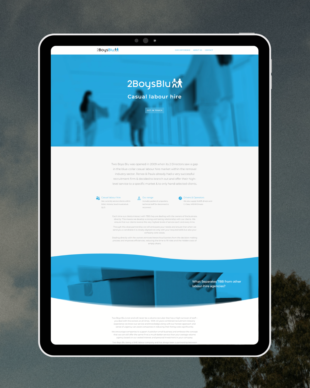
The “before”
The brief was a redesign. The real problem was underneath it.
Two Boys Blu's read on their own site was straightforward: it looked old and dated, so a redesign would sort it out. That's a fair diagnosis of what you can see. The site hadn't been touched since launch, and it looked it.
What surfaced once we dug in was that the look wasn't the only thing dated. The messaging was too - describing services the business had outgrown, aimed at a version of "who we serve" that had moved on. New colours and fresh fonts would have made the site look current. They wouldn't have changed what it said.
That's the trap with a design-only fix: put a new coat of paint on a site like this and the old message still bleeds straight through it. The homepage would have looked sharper and still told visitors the wrong thing about the business.
The order that mattered: message, then services, then testimonials, then visuals
Before we touched a single design element, the work went in this order:
The message. We rewrote what the homepage said about who Two Boys Blu serves and what they do - replacing language written for the business at launch with language that matches the business now.
The services. The business had grown since the site went live. The offer on the page hadn't. We brought it into line with what they genuinely deliver.
The testimonials. They had no testimonials on the old site, so we updated it with current client proof.
The visuals. New imagery that matched the business now, not the one when it launch.
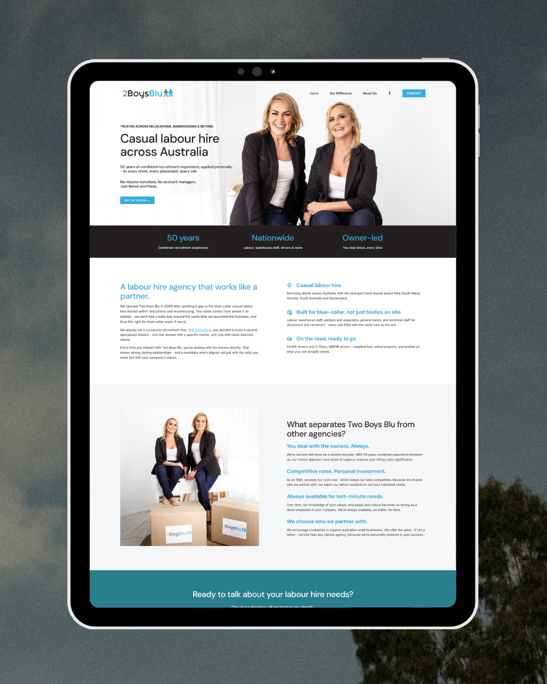
The “after”
Where the redesign came in - and why it came last
The design side ran as a single Website Sprint day. The messaging, services and testimonial work happened in the lead-up — the part that doesn't show up in a sprint but has to be sorted before one actually works.
Once the message, services and proof were settled, the rest moved fast: the site migrated from WordPress to Squarespace, the palette and type were refreshed, and the layout was restructured so a visitor could scan it properly. Renee and Paula moved to where they should have been from the start - front and centre, not buried under a paragraph of service copy.
That part took a day. It could only take a day because everything underneath it was already true.
What changed
Land on the site now and you get it within seconds: boutique, founder-led, hand-selected clients, not a number moving through a volume agency. The business didn't change to make that happen. The website just caught up.
If your own site has been through a round of copy tweaks and rearranged sections that still hasn't fixed the feeling that something's off, start here: 4 Quick Ways to Refresh Your Website Without Starting Over - same order of operations, laid out as a checklist. And if a full rebuild might genuinely be the answer instead, When to Update Your Website (And When Not To) will help you tell the difference.
You can see the result for yourself at twoboysblu.com.au.
If you’re still not sure what you need, get in touch with me and we can talk it through. I’ll help you figure out what your site actually needs and what steps you can take to get it there.