The 5-minute mobile audit you didn’t know you need
If your website is following global trends, it’s likely that more than half of your website's visitors are on their phone, not their laptop. According to Statista, mobile devices accounted for 51.48% of global website traffic in Q2 2026. That means that if your site is slow, cramped, or hard to tap on a small screen, they've probably already decided something about your business - even before they've read a single word. That's why it's worth checking your site properly on mobile, not just assuming it holds up because it looks great on desktop.
Why mobile is where most service businesses lose enquiries
Despite this fact, desktop is where most websites get built and reviewed. And it’s where I start with every website I build too. There's a name for this way of designing - responsive design - and I'll explain exactly what that means further down.
Bigger canvas, easier to get creative. It's where clients see the photos they chose, the copy I wrote, and the final layout they signed off on.
But it's rarely where their actual visitors show up.
Most service business owners haven't opened their own homepage on their phone in months. So they don't know when something stops working. They just notice the enquiries slowing down. On mobile, functionality beats design every time. If a site isn't functional on a smaller screen, people move on to the next provider fast.
[Faster than my kids asking for a treat when they hear the ice cream van]
If you haven't checked your website on your phone, you don't know whether it's working or not. You might be looking at slow enquiries and assuming the whole site needs a rebuild. But what if a five-minute mobile fix is all it needs?
What "responsive design" actually means
Earlier I mentioned this is how I build every site: responsively. Here's what that actually means.
Responsive design: building a website so it displays and works properly across every screen size, not just the one it was designed on first.
It's not about which screen you start on. Most Squarespace sites, including the ones I build, start on desktop. What matters is whether the layout, text, and functionality hold up once someone's viewing it on a phone. That's exactly what this audit is checking for.
The 5-minute mobile audit (do this now)
So here’s what I want you to do.
Pull out your phone and load your own homepage. Work through these five checks:
Time the first impression. From the moment the page loads, count how long before something feels cramped, slow, or hard to tap. Under ten seconds isn't a mobile problem, it's a structure problem showing up on a small screen.
Find your main button. Your primary call to action should be visible without scrolling and big enough to tap without zooming in. If you have to hunt for it, so does everyone else.
Then try tapping it. An invisible element, like a transparent image layer, can sit on top of a button and block the tap without you ever seeing why.
Read your headline out loud. Does it make sense as written, or does it break awkwardly across three lines because it was written for a wider screen?
Send yourself an enquiry. Go through your own contact form or booking flow, start to finish, on your phone. Note every point where you hesitate or have to think about what to do next.
Check for overlap. Scroll the full page and look for text sitting on top of images, buttons touching each other, or sections that feel squashed together.
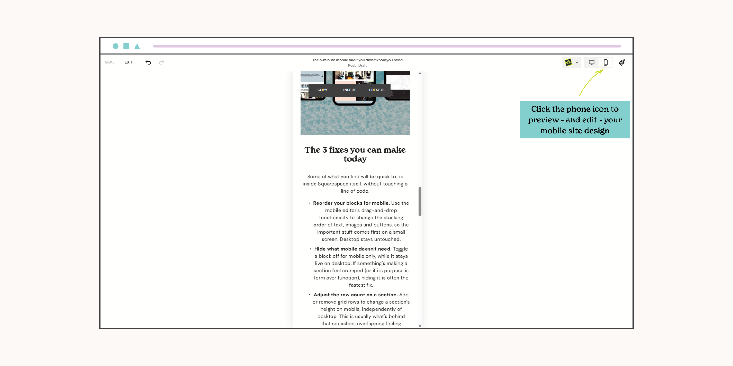
The 3 fixes you can make today
Some of what you find will be quick to fix inside Squarespace itself, without touching a line of code.
Reorder your blocks for mobile. Use the mobile editor's drag-and-drop functionality to change the stacking order of text, images and buttons, so the important stuff comes first on a small screen. Desktop stays untouched.
Hide what mobile doesn't need. Toggle a block off for mobile only, while it stays live on desktop. If something's making a section feel cramped (or if its purpose is form over function), hiding it is often the fastest fix.
Adjust the row count on a section. Add or remove grid rows to change a section's height on mobile, independently of desktop. This is usually what's behind that squashed, overlapping feeling flagged in the audit.
The fixes that need a designer
Some issues run deeper than a settings panel and you may need some expert help to get them fixed:
Page structure that was built desktop-first, where content order genuinely doesn't work on a small screen
Image compression across a whole site, not just one page
Custom code or third-party integrations behaving differently on mobile
Navigation that needs rethinking, not just resizing
Changes that affect the design sitewide, not just on mobile (font sizes, section styling etc.)
If your audit turns up more than one or two of these, that's a sign the fix isn't really about mobile. It's about the site's underlying structure.
Where to go from here
A five-minute audit tells you a lot, but it can't tell you everything. If what you found feels bigger than a font size or a button, that's worth knowing properly, not guessing at.
That's exactly what the Website Roadmap is for. A strategy session that tells you what your site needs (holistically), so you're not stuck fixing things one at a time and hoping it adds up.
Want to know more? Explore the Website Roadmap ➝