Boost Your Conversions - Top Tips for Your Contact Page
If the contact page on your website was written as a bit of an afterthought, or just thrown together with a contact form and a quick “Get in Touch” headline, then this is the post for you!
When a potential customers come to your site, they’re looking for a solution to their problem. They may browse your home page, hop on over to check out your services, and then read your intro on your about page. Along the way, they’re collecting bits and pieces of information and putting them together, kind of like a puzzle. Your website copy should strategically guide them from one piece of the puzzle to the next, so they’re not left floundering looking for those all-important corner pieces.
Your contact page is the very last piece of the puzzle and completes that picture for them. It’s not a random piece leftover from another puzzle that has nowhere to go!
Had enough of the puzzle analogy? Alrighty, moving along then… 😂
As a digital marketing consultant with a passion for crafting exceptional user experiences, I’m pretty excited to share these 10 proven strategies that will transform your contact page from a forgotten afterthought, to a cornerstone in your website conversion strategys. From instant scheduling to simple instructions, I’ve got you covered!

What you don’t want your contact page to do!
Before you start optimising your page, have a think about what you want it to do! Or even, what you don’t want it to do. By the time the reader reaches your contact page, they’re 99% of the way to converting into a lead. They’re ready to get in touch and go from a “potential” lead to “solid” lead. But if they hit a page that has just the bare bones, you could turn them away instead.
It could leave them feeling like contacting you is transactional, rather than personal. It could cause a risk-averse person to get nervous and bounce from the page. It could plant a seed with them that you’re inexperienced or unprofessional. It could even kill your brand vibe and erase all of the goodwill the rest of yout site built up for you.
Instead, you want to make sure your contact page aligns with the feel of the rest of your site, reiterates how awesome and professional you are, makes it easy for people to get in touch with you, and take them over the finish line and prime to sign on the dotted line.
#1. Say hello
Simple, but effective.
Don’t just use the stock standard headline of “contact me”. Boring! Try “Hello beautiful”, “Let’s chat” or “Want to have a coffee?” instead. Greet your reader and make your reader feel important, seen and like a person. Not just another transaction.
#2. Add your photo
People buy from people.
Add a photo of yourself - facing the camera - to your contact page. Again, this will have the effect of personalising the page and making the contact feel less transactional. People want to see who they’re getting in touch with and know it’s not just another bot replying to them.
#3. Be super clear
Tell the reader exactly what you want them to do. For example: “Fill out the form below….” or “Book your free call today.” Then after they have submitted the form or made a booking, tell them what to expect. This could be a thank-you message, an estimated response time (“I’ll get back to you within 2 business days”), or a suggestion to explore related content on your site.

#4. Get your forms right
When it comes to contact forms, less is often ore. Streamline your form fields to only ask for essential information. Too many fields will make your form a barrier to contact as many people just can’t be bothered to answer too many questions. So, keep it simple, reduce the friction and get more info when you make contact after their initial enquiry.
Also have a think about where on the page you place your form. You want to make sure it’s easily accessible without overwhelming the page. And you should test it on mobile to make sure it’s easy to fill in on a phone, and isn’t too long. I’d suggest keeping it name, contact info and one or two other questions max.
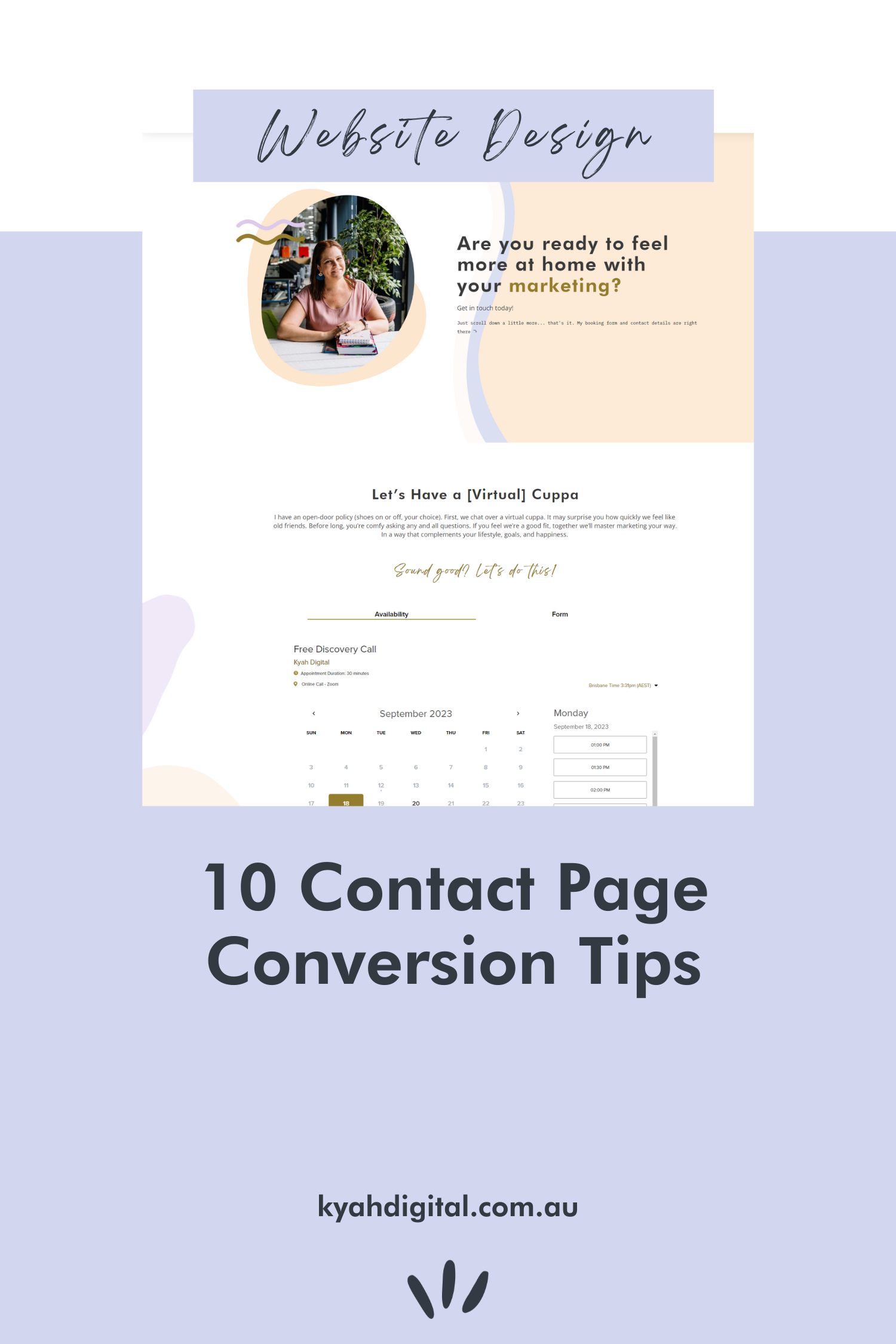
#5. Embed a scheduler
Let people book a time with you directly and avoid the annoying back and forth that comes with scheduling a meeting time. I personally use Dubsado as it kicks off my entire customer experience, and I can embed it right here on my site. Easy for me, easy for a potential client.
#6. Keep your availability up to date
If you only work on specific days, have every Friday off, or typically book a month or two in advance, let people know. This can help convert someone who may be dragging their feet, or set expectations for response times.
#7. Build trust
You will probably have done this throughout your site, but adding trust-building elements to your contact page is still a good idea. Add customer testimonials, industry awards and recognisable client logos to establish credibility and alleviate any lingering concerns. Having these reminders on your contact page may just push that last lingering question out of a visitor’s mind and get them over the line.
#8. Use the power of video
Looping back to tip #2 - people buy from people. So add a video to your page! Use it to welcome your reader and reinforce that they are making a good decision.
#9. Highlight how risk-free it is
If you offer a free initial call or some other kind of risk-free policy, make sure the reader knows about it! If the initial call is only 15 minutes, that might help convert those that are always too busy. If you offer calls out of typical work hours, that may convert people who are in different timezones. If your first call is free, this may convert the budget-conscious or undecided.
#10. Answer a few questions
Add an FAQs section to the page to answer some of the questions you get more frequently that don’t necessarily require a call. This may help weed out visitors who are not a good fit for you, and help convert those who are.
By implementing these contact page conversion tips, you’ll be well on your way to creating an engaging, user-friendly experience that encourages meaningful interactions with your visitors. Remember, optimisation is an ongoing process, so keep an eye on your analytics, test different headings, intros, photos and forms, and continue refining your approach to get your contact page to become the converting powerhouse that it should be.